Colour can fill our rooms with joy, light and warmth. It breathes new life into a neglected space. Here, we’ll take a short jaunt through colour and its influence on mood.
Colours impact our décor in many ways. Some are energizing and others are soothing. Though there is no concrete scientific evidence to support this, the fact remains we do feel the effects of colours on our mood.
American psychologist Dr. Dawnn Karen launched the viral term Dopamine Dressing in 2020 to describe the euphoric benefits of wearing cheerful colours. Dopamine is called the “happy hormone”. The trend emerged in the fashion world after two years of the pandemic as if to chase away misfortune and, more importantly, boost morale.
The wave did not stop at our closets. Dopamine Decor quickly invaded TikTok and Pinterest. Staid white and beige interiors gave way to exhilarating rainbow hues—some with a greater pizzazz factor.
Colour Expert and Founder of Kryptonie The Color Agency, Marie-Chantal Milette, enthusiastically agrees: “From the start of the pandemic, I was saying how this would mark the beginning of a dramatic return of colour to our interiors... and I was not wrong! The phenomenon, Dopamine Decor, is linked to the optimism and zest for life we needed after all that happened in the last few years. Our minimalist, soulless interiors no longer meet the growing need to indulge and celebrate ourselves.”
Red
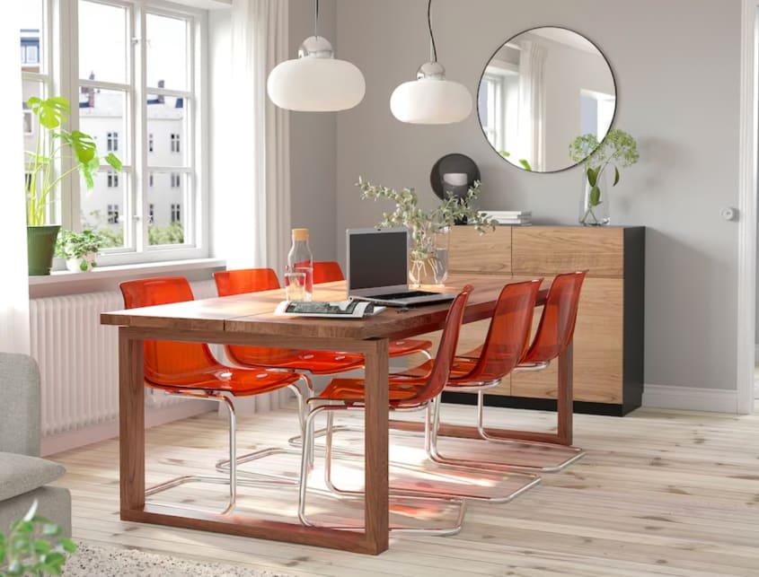
Red is energizing and stimulating. It’s recommended in spaces such as the living room, kitchen and dining area. It’s also appropriate at the entrance of a house because of its warm and inviting vibe. Though a key player in the Dopamine Decor trend, it may feel intimidating if used in large doses. A commode, cushions or a backsplash can make it an indelible feature of your décor.

Pink

It can be electrifying or soothing and soft, depending on the shade. These days, it tends to be more on the intense side. According to the world’s leading colour authority and trendsetter, the Pantone Color Institute, Viva Magenta is the colour of the year 2023. It’s an intensely pigmented raspberry pink, bordering on red. The Barbie movie, release scheduled for July, validates the omnipresence of this candy tone in décor, fashion, and makeup. Vibrant pink can be anywhere in the house, whether in furniture and accessories or on a wall.

Orange

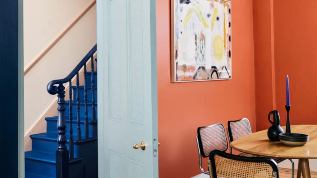
Joyful, sparkling, and indulgent; it brightens up any interior. It resurrects a cool retro 70s vibe and it remains faithful to blue, its chromatic alter ego. Orange is also a friend to black and white and asserts vintage charm by uniting with green, its inseparable psychedelic companion. You can incorporate it into the living room with a sofa or velvet cushions, or in the kitchen with resin chairs.

Yellow

A pure sunlight tonic that refreshes and revitalizes. It’s said to stimulate the intellect, which makes it a perfect colour for your home office. A worthy descendant of the 70s palette, the ochre shade is still very prominent in home décor. A low sofa (typical of the period), an ottoman, a ceramic accessory, or an amber glass vase: there’s no shortage of items on the market to make the most of this beautiful hue.


Green

Peace, calm, harmony—green is linked with many beneficial effects. It bolsters concentration, making it another ideal colour for your office space. During the pandemic, pastel tones were featured extensively by paint manufacturers (especially sage, everywhere) for their soothing effects and because they provided a sense of connection with nature that we desperately needed. Green is back with a much broader and more intense palette (shades of ivy and moss, among others). For Marie-Chantal Milette, green is riding high and is the best candidate to replace the grey in our interiors.
"Nature as the ultimate neutrality is universally accepted, and it brings about a sense of well-being and spiritual renewal."
– Marie-Chantal Milette


Blue

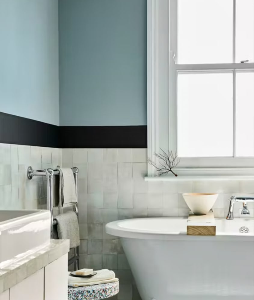
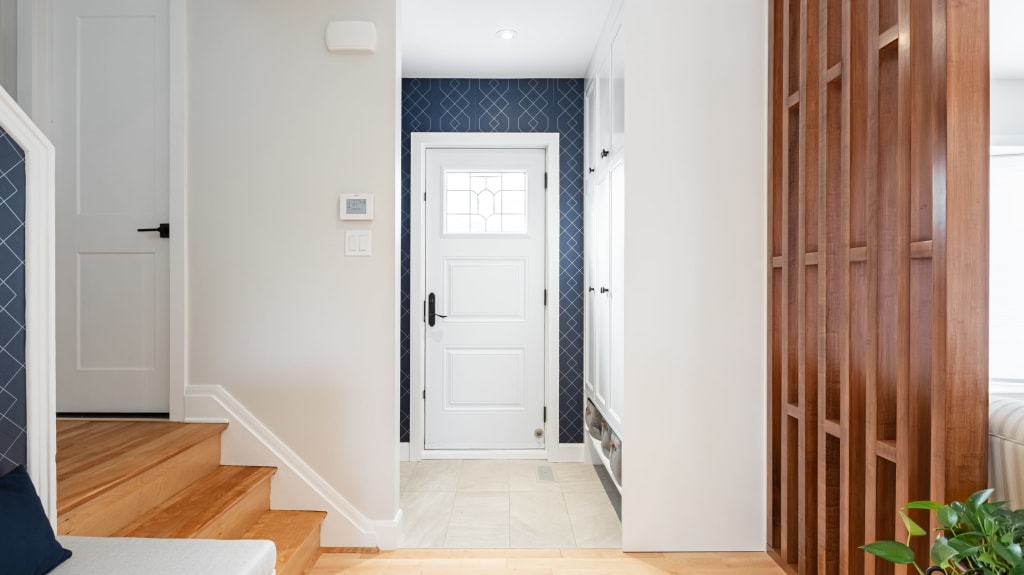
Blue is known for inducing relaxation, well-being and introspection. The idea of an azure bathroom or bedroom quickly comes to mind, but who says we can’t bring it into the kitchen or living room as well? Scandinavian and Farmhouse styles are not all creamy white and black; they also feature greyish blue and denim-like shades, which are very popular for cabinets and accent walls. Take care with certain shades—too dark or too cold—that could make for a gloomy atmosphere.
