One colour can dramatically change the vibe in a room. Fill your home with vibrant colours. It’s good for the spirit and pleasing to the eye!
Colour: a little, a lot, with passion
There are countless ways to add colour to your home.
Paint and wallpaper
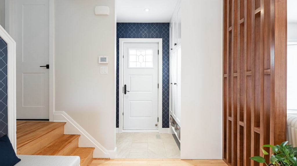
You can go all out and cover all the walls in a room or stick to one accent wall to contrast with the others in neutral colours. Wallpapers and wall decals make it easy to add patterns to the mix.

Another idea is to paint the lower part of the wall, half or two-thirds of the way up. Decorative mouldings (called chair rails) or an understated shelf can be used to accentuate the separation between solid colours. Choose a darker shade below the moulding and a lighter one above, giving the room the illusion of height.

Doors are great for playing with paint colour. Think about your front door and how a poppy red or lemon yellow would defy the usual black or brown. Wood furniture can also be revived with a few strokes of the brush.


Feeling adventurous? Stairs are a great starting point. Alternating colours between the steps and risers can give a spectacular result, especially if you use the entire rainbow!

Furniture and accessories
No need for brushes, rollers, and stepladders to bring a new colour palette into your home. A hammer and a few nails are all it takes to create a gallery wall (very trendy!) by hanging a collection of colourful paintings and photos together.
You can reveal your love for a particular hue with furniture, especially the sofa, which plays a leading role in your living room decor. A carpet, curtains, a light fixture, or dishes displayed in a curio have the power to make a splash. Cushions, a tablecloth or bedding can be used to change the colour theme of a room easily and often.

The art of mixing
There are no hard and fast rules for mixing and matching colours. We all have our own affinities and emotions. What is visually pleasing for some may seem garish and irritating for others. Marie-Chantal Milette, Colour Expert and Founder of Kryptonie The Color Agency advises many clients on branding. She cites an example of colour choices she made for the reception area at the Fertilys Fertility Clinic in Montérégie. She opted for a vibrant palette that included various shades of purple, mint green and even bursts of orange. “It’s not what you’d normally expect from a clinic, but each colour was strategically thought out based on the clientele and the comfort we wanted them to feel when they arrived on the premises", she says.
"It’s not so much the colour scheme that matters but rather the reasoning behind its creation. If everything is strategically considered, it’s a winning combination for me!”
– Marie-Chantal Milette
There are a few basic principles that can be applied (or not!).
A duo
If the mere sight of a colour chart is enough to give you a headache, stick to a two-colour combo. In art class, students learn that complementary colours work well together (for example, blue and orange). Bold contrasts always make a statement. Try varying the intensity of one or two shades, e.g., pairing soft pastel blue with tangy tangerine orange. We can also “play duets” using bright colours and natural tones, such as sunny yellow paired with blush pink.


For painting, chromatic groups can be applied in solid colours with crisp lines (colour blocking) or in subtle gradations to softly fade shades into one another. Do you like the effect of blended colours? Blurred, aura-like designs are extremely popular for wall art.
EspaceProprio Tip The interplay between two colours must be carefully balanced. That’s not to say a 50/50 split, which doesn’t create a focal point because one shade cancels the other. It’s better to emphasize a dominant colour and complement it with a secondary hue, opting for a ratio of 2/3 + 1/3 or 3/4 + 1/4.

A trio
Do you have a colourful imagination akin to that of Andy Warhol? Break free and dare to tap into the rainbow; your home will radiate joy! Or do you prefer a laid-back chromatic adventure? Go with three shades, including at least one that is neutral. Here again, the ratios are important. A formula that works well consists of a main colour (wall or sofa), a minimal colour used sparingly (chair, ottoman or door), and a touch of colour (cushions, lamps or frames). The infallible 60-30-10 rule helps to allocate the shades: 60% for the dominant shade, 30% for the secondary shade, and 10% for the accent shade.
“I believe that moving forward, the more unusual colour combinations will be in the spotlight. More and more people want to express a part of their personality through their decor,” says Marie-Chantal Milette. “If we finally come out of this recession, people will be even more likely to celebrate with bright, cheerful colours to accompany their sense of relief. Mixing earthy shades with neon, pastels with darker colours...we may be quite surprised in the coming years!” concludes the expert.


