It's no secret that colour trends are constantly evolving. Colour does more than play into fashion and interior design —it acts on our emotions too. Want to know what colours are on trend this year? Some are sure to be a hit as the weather gets cooler. Let's cozy up with a cup of tea and take a look.
10 colour trends for 2023–2024
Colours speak to us and elicit reactions. They have the power to draw our attention and make the features in a room pop.
Look at the hottest hues that creative professionals are using and get a sense of what you like—and what you might want to take home with you.
Pantone is an endless source of inspiration. The colour company has a knack for blending the eclectic and the aesthetic to guide top designers as well as home owners.
Dive right into the Magentaverse to see all that it offers and find inspiration in those ideas. Are you ready for the top 10?
1. Viva Magenta

First up is 2023's colour of the year. Intense and eye-catching, this magenta is a nuanced crimson red that's halfway between audacity and passion. This colour really pops, so it's best to use it sparingly in your home.
Pantone code: Viva Magenta – 18-1750
2. Gray Lilac

Gray Lilac is subtle, soft, and soothing. It's perfect for rooms where you want to keep cool, calm, and collected: a family room, a meditation corner, an office space, or even a creative workshop. Use it on an accent wall for a comforting atmosphere.
Pantone code: Gray Lilac – 13-3804
It's in the same family as Lavender Cream, TrendBook's Color of the Year for 2023.
3. Pale Khaki

For a natural ambiance, opt for this shade of beige by Benjamin Moore. Pale Khaki blends beautifully with neutral tones like white and gray, and even with bright colours.
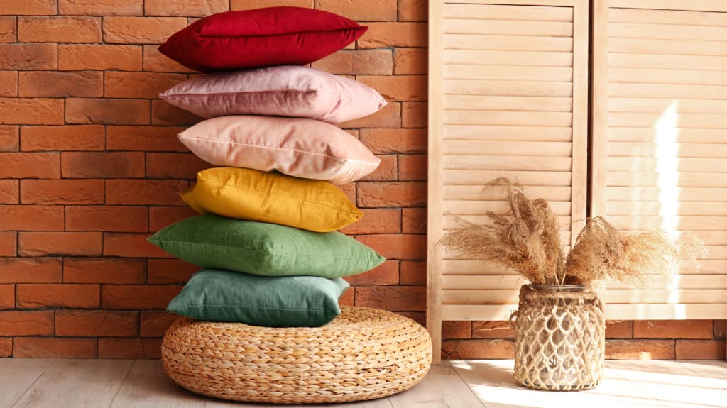
Let it pop with accessories like cushions, rugs, sheets, or artwork. Or go all-in and use it to make a room a blank canvas.
Pantone code: Pale Khaki – 15-1216
4. Gray Sand

Elements of nature are in the spotlight this season, and gray sand is no exception. This versatile colour has everything to rival the traditional whites of this world. It's a great alternative for the walls of your home.
Over at TrendBook, the buzz is all about Brown Sand. Its warmth reminds us of the beach and gets us dreaming about the next summer solstice.
Code Pantone : Gray Sand – 13-1010
5. Pale Dogwood

Named after the dogwood flower, this shade of pink exudes romance and grace. With touches of white and cream, it adds effortless elegance to any environment.
To boost the effect, combine it with other trending colours like Gray Lilac and Pale Khaki.
Pantone code: Pale Dogwood – 13-1404
6. Sparkling Grape

Tempted to go "grape" with curtains, a vase, or a footstool? The time is ripe! Get your sparkle on with one of London Fashion Week's flagship colours.
Sparkling Grape is a great choice if you want to make your decor a little fruity. Pair it with a powder pink or pale peach for an even bolder combination.
Pantone code: Sparkling Grape – 19-3336
7. Forest Night

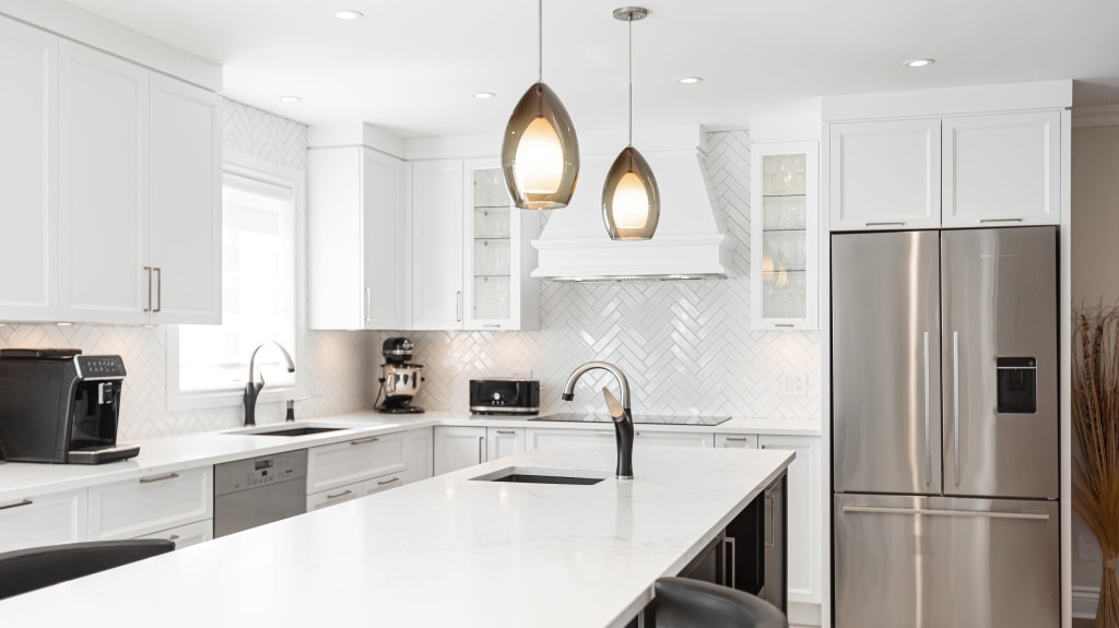
Mystery, desire, and density are the name of the game in this dine-in kitchen that’s to die for. Forest Night carries us into the evening and sits well alongside earthy hues such as beige, brown and gray.
Pantone code: Forest Night – 19-0414
8. Hot Fudge

Are you more caramel or chocolate? This warm brown is everything your heart desires. It's the elegant choice for a welcoming palette.
Bring it to life with a leather sofa, a lamp, a chest of drawers, or a comfy blanket.
Pantone code: Hot Fudge – 19-0913
9. Eclipse

Eclipse is dramatic and powerful. It's ideal for setting a focal point in a room, but too much can weigh a space down.
Pair it with a pale shade for an eye-catching contrast. May we suggest two of our favourites, Pale Khaki or Coconut Milk?
Pantone code: Eclipse – 19-3810
10. Coconut Milk

Coconut Milk is a classic beige/off-white that excels in the art of versatility. You can't go wrong with this choice, especially if you live in a small space and want to bring light into your home. Accents like this wooden headboard will complement it beautifully.
Pantone code: Coconut Milk – 11-0608
How to play with colour

Need some inspiration to work these subtle and not-so-subtle shades into your living space? Choose the colours you like and explore different ways to play with them.
Get the latest colour palettes
Find interesting colour schemes and decorating trends with reports from leading companies and colour palette generators like Adobe Color and Paletton.
Even good old-fashioned trial and error may surprise you. You can always use a colour wheel for inspiration too.
Shake it up with textures and patterns

Objects, textiles, furniture, and wallpaper can all take a colour to the next level. Opt for unique textures and patterns in your chosen hue, and you're sure to make it shine.
Use an inspiration board to visualize your ideas and adapt them to what you have in mind.
Create focal points
Draw attention to certain areas of your home by using contrasting colours. Create visual impact with a vivid hue juxtaposed against a neutral wall. Try a splash of purple to accent a cream palette in your lounge, for example.
For more EspaceProprio content, visit our Instagram account @espaceproprio.


